
/04
WeatherWell
Defined and shipped a navigation overhaul to bring users faster to value-driving features, increasing Journal conversion by 5.9%, Symptom Logging by 6%, and improving early retention.
Context
WeatherWell is an iOS app for weather-sensitive people built around personalised forecasts and medically reviewed health guidance. Retention depended on delivering relevant health guidance and that required users to log symptoms consistently. Without seamless logging, the system couldn’t generate meaningful insights.
When I joined during Product market fit validation, conversion into Symptom Logging and Journal was low. The issue wasn’t value; it was misleading navigation that made core actions harder to reach. We made an effort to redefine navigation as a strategic lever to unlock guidance and strengthen retention.
Results
After 4 months of deep product discovery process we introduced a new seamless, user-friendly navigation that prominently showcases important functionality and brings users close to the value. We have managed
to increase conversion rate of Journal page by +5.9%, and symptom logging by +6%.

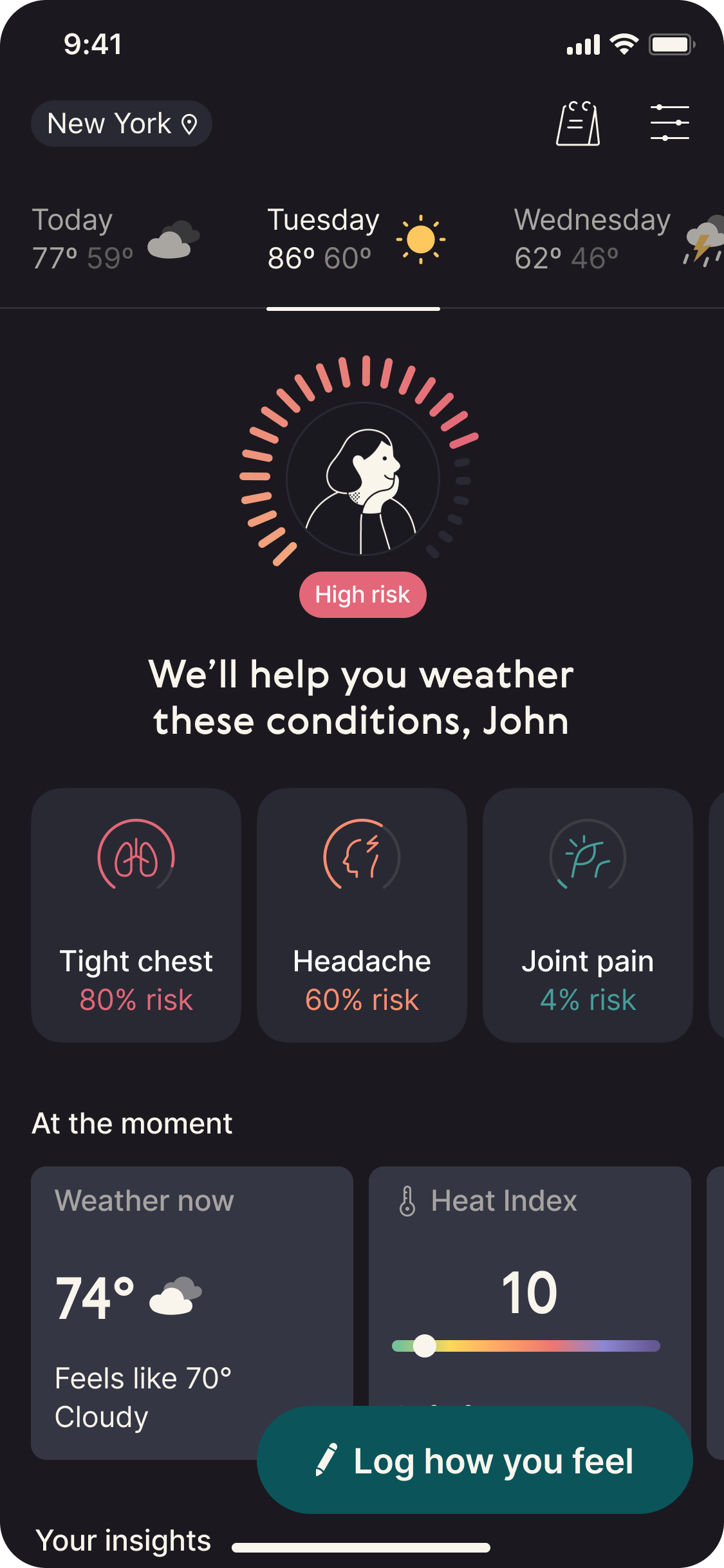
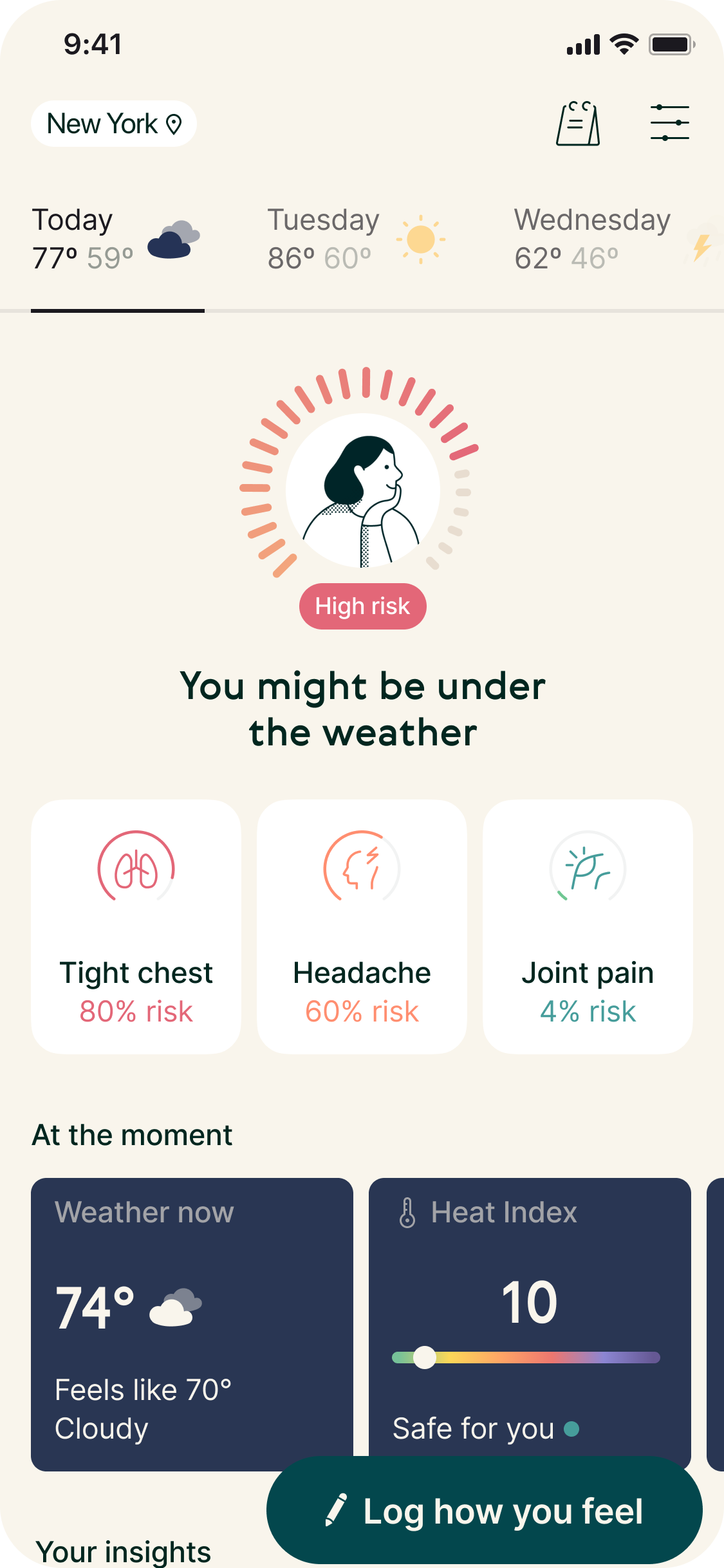
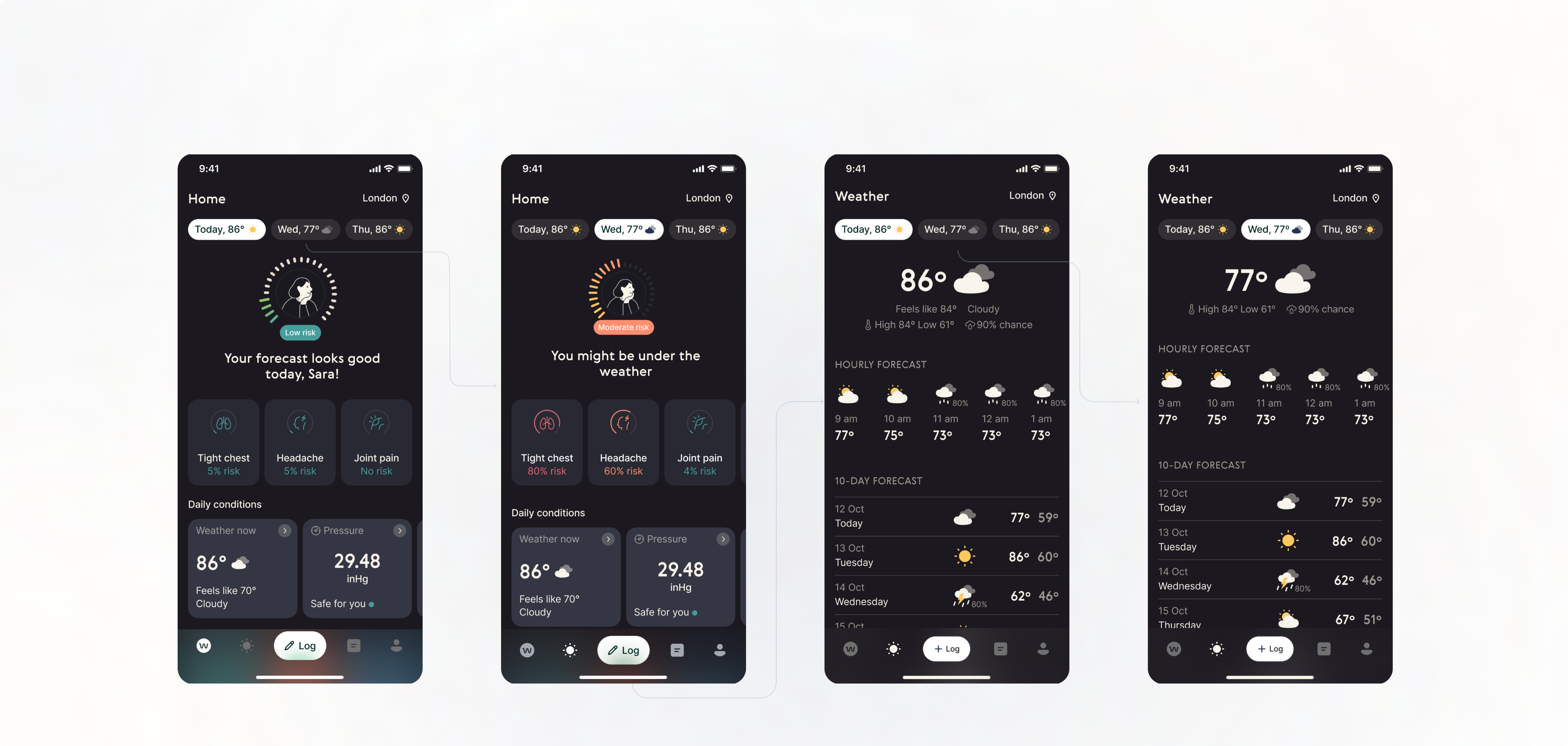
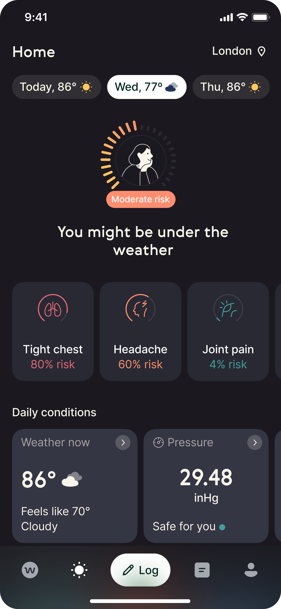
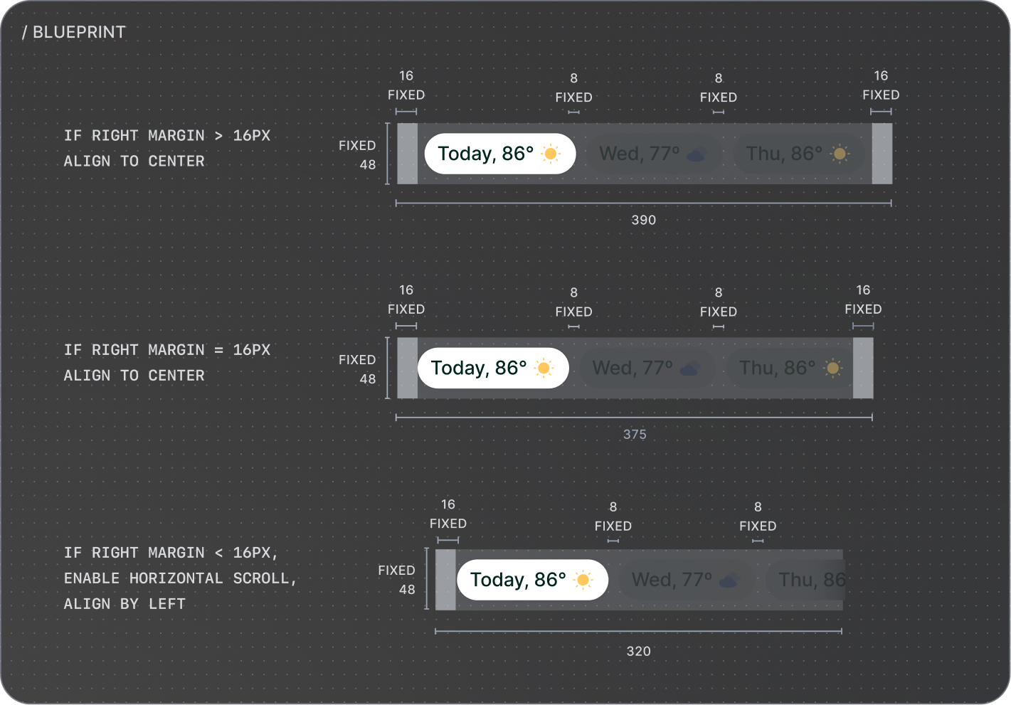
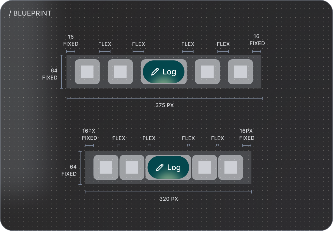
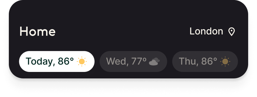
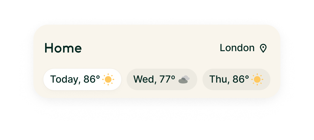
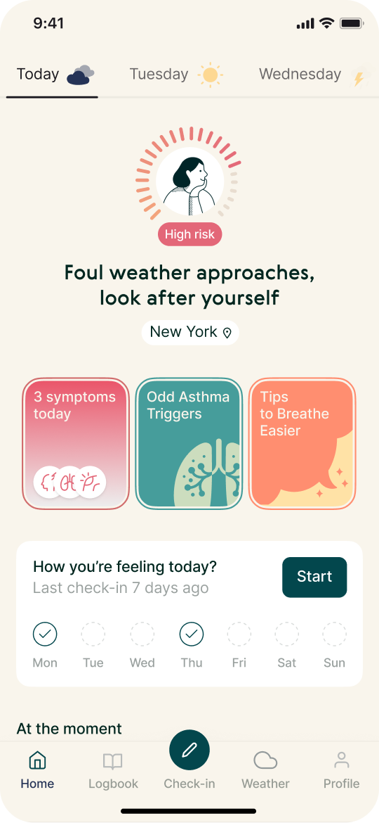
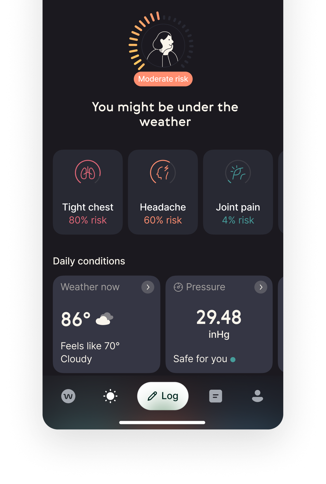
Visually heavy and inconsistent upper navigation that takes a lot of space.
Current entry points to key features scattered across the Home screen
and hidden under unclear icon.
Log button even though quite big,
lacks contrast against darker elements such as weather tiles.


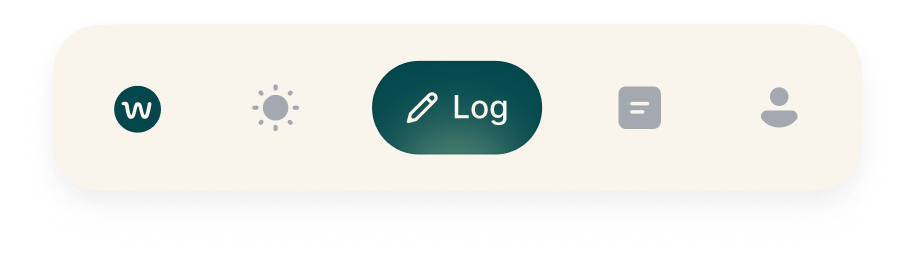
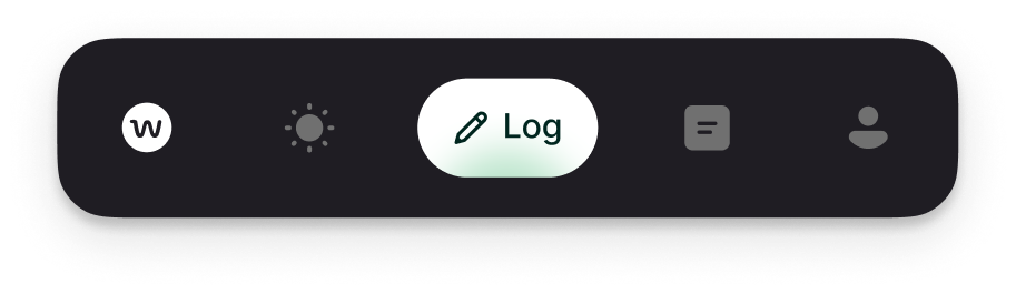
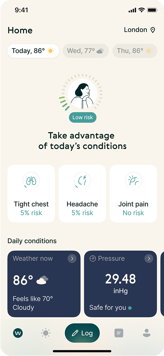
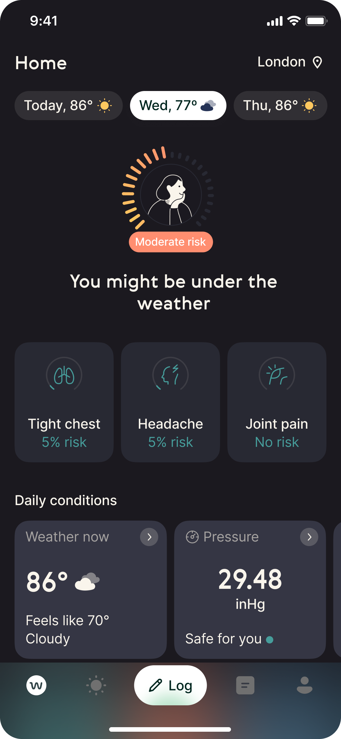
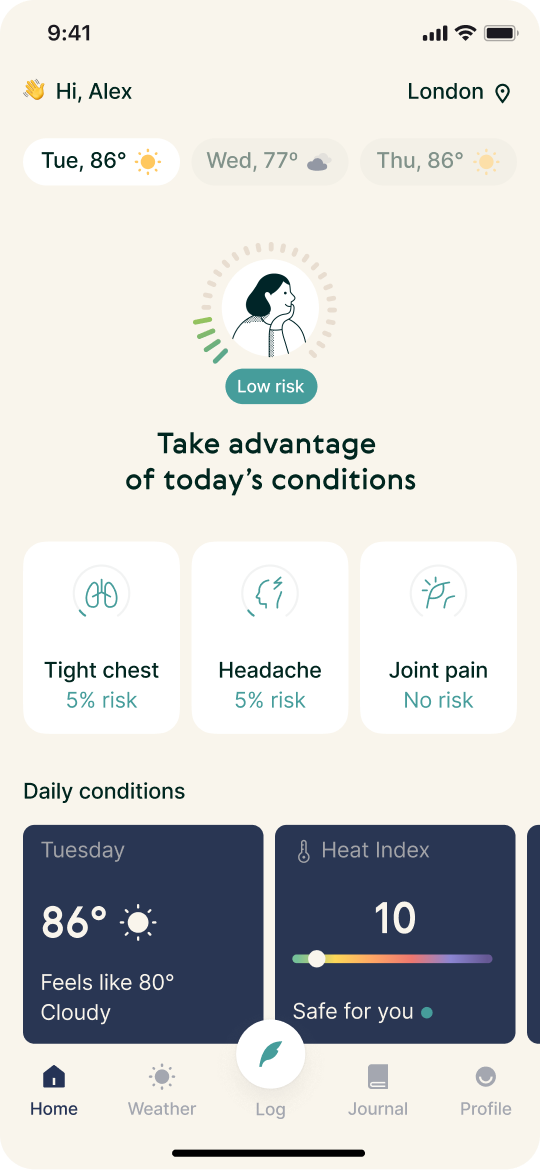
Before - light & dark mode
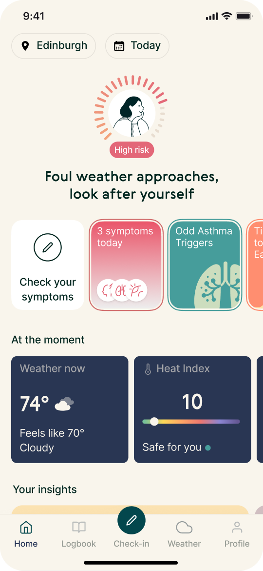
After - light & dark mode
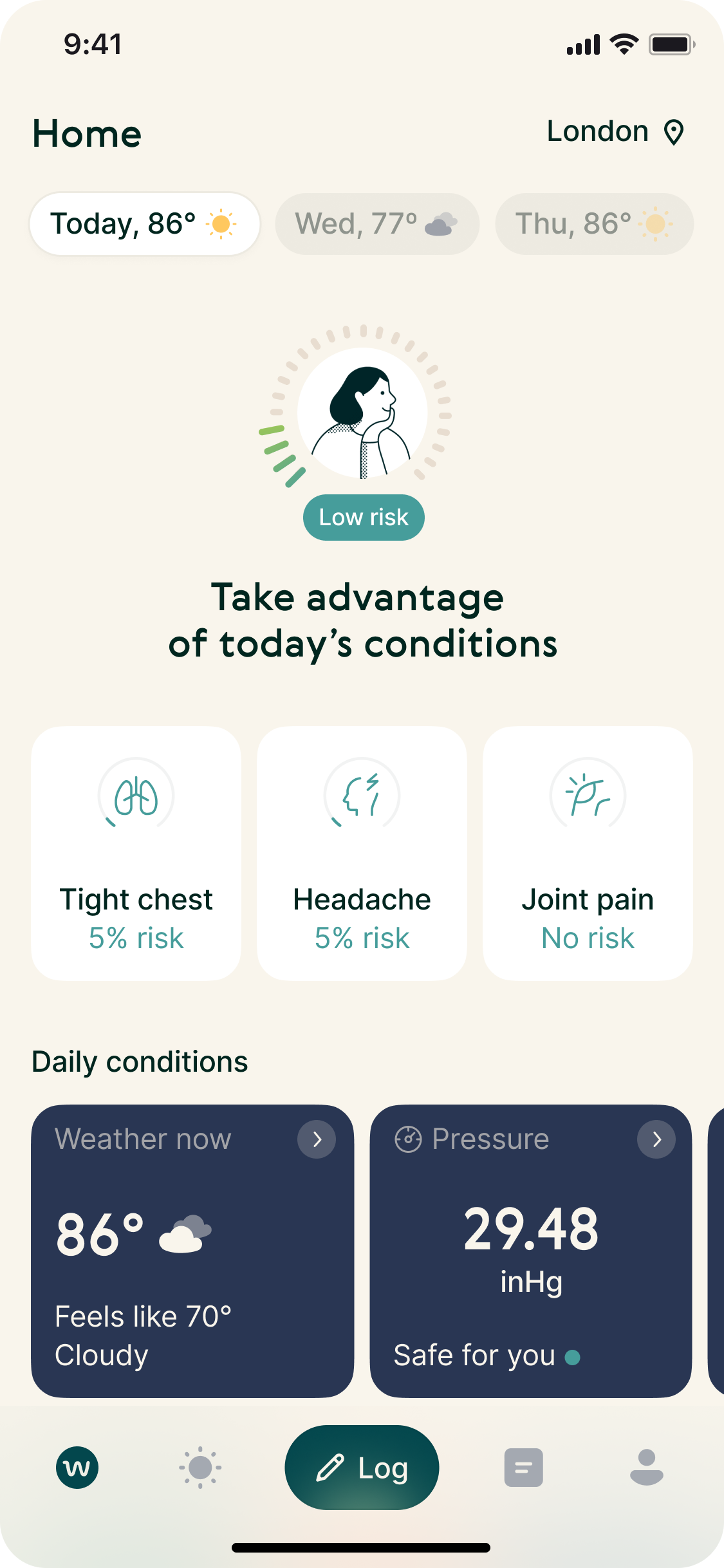
Simple and consistent upper
navigation. Clearer visual feedback
and confirmation.
Key feature grouped together in
a touch-friendly, intuitive tab bar.


Discovery
Symptom Logging and Journal had already proven their impact on retention. The friction sat earlier in the journey. Product analytics showed low entry into both features, and I reframed the problem around time to value rather than feature design.
Key hypothesis
We believe that clearly exposing Symptom Logging and Journal to the user in main navigation will improve time to value, as measured by conversion and short-term retention (D1-D7).


I synthesised existing research and directed targeted interviews to validate emerging patterns. The signal was consistent: navigation felt visually dense, structurally unclear, and slowed users down from reaching the actions that mattered. Users weren’t rejecting the features they were failing to reach them fast enough for them to become habitual.
Ideation and testing
I drove rapid, low-cost prototype cycles focused on structural clarity and prioritisation of key actions. At a product market fit stage, reducing decision risk mattered more than perfecting execution. Multiple navigation architectures and hierarchies were explored and pressure-tested with users in tight feedback loops.
Each iteration was evaluated against its ability to move users to value faster. Once a clear direction emerged, I defined the navigation system and moved it into a controlled release. Amplitude tracking was set up to monitor conversion and supporting metrics in real time, ensuring the team could respond quickly to behavioural shifts.


Explorations
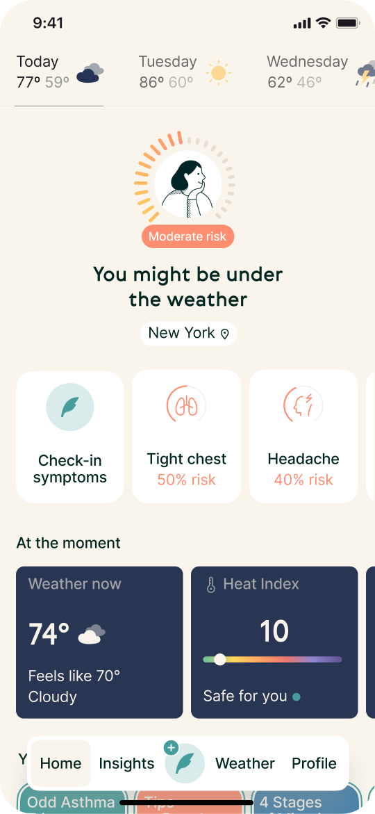
Few iterations later...
Initial post-launch data showed a drop in Symptom Logging conversion. Analysis revealed that while the structure improved, the logging entry point lacked sufficient visual prominence.
A rapid adjustment resolved the issue. Following the fix, Symptom Logging conversion increased by 6% and Journal conversion by 5.9%, with D1–D7 retention improving by 2.5%.

Reflections
01
Navigation is a primary driver of time to value. Treating structural decisions as strategic product market fit levers allowed us to reduce product risk earlier and with greater confidence.
02
Continuous user feedback is most effective when embedded into decision cycles, not treated as validation at the end. Keeping users close to each iteration sharpens direction and prevents over-investment in unproven solutions.
03
No amount of pre-launch testing fully predicts real-world behaviour. It requires disciplined post-launch monitoring, fast interpretation of signals, and decisive iteration to protect outcomes.

Credits
Shout-out to people that helped and made it happen!
Me & Aleksandr Loviagin
Product Design
Sergey Yanovskiy
Chief Executive Officer
Olga Sadouskaya
Clinical Product Manager
Curious about the details?
Let’s chat!


/04
WeatherWell
Defined and shipped a navigation overhaul to bring users faster to value-driving features, increasing Journal conversion by 5.9%, Symptom Logging by 6%, and improving early retention.
Context
WeatherWell is an iOS app for weather-sensitive people built around personalised forecasts and medically reviewed health guidance. Retention depended on delivering relevant health guidance and that required users to log symptoms consistently. Without seamless logging, the system couldn’t generate meaningful insights.
When I joined during Product market fit validation, conversion into Symptom Logging and Journal was low. The issue wasn’t value; it was misleading navigation that made core actions harder to reach. We made an effort to redefine navigation as a strategic lever to unlock guidance and strengthen retention.
Results
I defined a new navigation model that elevated core actions and simplified the product structure. The redesign increased Journal conversion by 5.9% and Symptom Logging conversion by 6%, while D1–D7 retention improved by 2.5%. Beyond metric movement, the work aligned product architecture with value delivery and established a clearer path toward product - market fit.

Visually heavy and inconsistent upper navigation that takes a lot of space.
Current entry points to key features scattered across the Home screen
and hidden under unclear icon.
Log button even though quite big,
lacks contrast against darker elements such as weather tiles.


Before - light & dark mode
After - light & dark mode
Simple and consistent upper
navigation. Clearer visual feedback
and confirmation.
Key feature grouped together in
a touch-friendly, intuitive tab bar.


Discovery
Symptom Logging and Journal had already proven their impact on retention. The friction sat earlier in the journey. Product analytics showed low entry into both features, and I reframed the problem around time to value rather than feature design.
Key hypothesis
We believe that clearly exposing Symptom Logging and Journal
to the user in main navigation will improve time to value, as measured by conversion and short-term retention (D1-D7).
I synthesised existing research and directed targeted interviews to validate emerging patterns. The signal was consistent: navigation felt visually dense, structurally unclear, and slowed users down from reaching the actions that mattered. Users weren’t rejecting the features they were failing to reach them fast enough for them to become habitual.
Ideation and testing
I drove rapid, low-cost prototype cycles focused on structural clarity and prioritisation of key actions. At a product market fit stage, reducing decision risk mattered more than perfecting execution. Multiple navigation architectures and hierarchies were explored and pressure-tested with users in tight feedback loops.
Each iteration was evaluated against its ability to move users to value faster. Once a clear direction emerged, I defined the navigation system and moved it into a controlled release. Amplitude tracking was set up to monitor conversion and supporting metrics in real time, ensuring the team could respond quickly to behavioural shifts.


Explorations
Few iterations later...
Initial post-launch data showed a drop in Symptom Logging conversion. Analysis revealed that while the structure improved, the logging entry point lacked sufficient visual prominence.
A rapid adjustment resolved the issue. Following the fix, Symptom Logging conversion increased by 6% and Journal conversion by 5.9%, with D1–D7 retention improving by 2.5%.
Reflections
01
Navigation is a primary driver of time to value. Treating structural decisions as strategic product market fit levers allowed us to reduce product risk earlier and with greater confidence.
02
Continuous user feedback is most effective when embedded into decision cycles, not treated as validation at the end. Keeping users close to each iteration sharpens direction and prevents over-investment in unproven solutions.
03
No amount of pre-launch testing fully predicts real-world behaviour. It requires disciplined post-launch monitoring, fast interpretation of signals, and decisive iteration to protect outcomes.
Credits
Shout-out to people that help to make it happen!
Me & Aleksandr Loviagin
Product Design
Sergey Yanovskiy
Chief Executive Officer
Olga Sadouskaya
Clinical Product Manager
Curious about the details?
Let’s chat!


